기파란의 이름 배경은 생각보다 단순하다. 한국인이라면 누구나 쉽게 떠오를 신라시대 화랑의 이름 ‘기파랑’에서 따온 것이다. 젊은 화랑이 지닌 열정적이고 도전적인 모습과 인자한 성품의 느낌이 글자의 인상과 어울린다고 생각했다. 살짝 넓은 너비의 수직 수평의 민부리형 구조는 젊은 무사의 기개를, 부리의 디테일과 중간중간의 부드러운 휴머니스트적 터치는 화랑의 인품을 표현해보고자 했다. 이름을 특별히 살짝 변경한데는 이유가 있다. 한자음을 해석하자면 랑은 사내를 칭한 것인데 제작자로써 서체에 성별을 더하고 싶지 않았기 때문이다. 란으로 바꿔 단어 그대로 ‘파란’이라는 단어가 더 느낌적으로 잘 어울린다는 판단이 들었다.
Giparan Family
기파란 패밀리
‘Giparan’ is a neo-humanist semi-serif with subtle details. It started with the idea of creating a typeface that smoothly blends the feel of the sans-serif and the semi-serif. When serifs and details are added in a natural way within the unadorned structure of the sans-serif, it creates a character with firm charisma and a gentle expression. Giparan derives from the name of ‘Hwarang’ (Young Knight) in the Shilla Dynasty, ‘Giparang’. The slightly wide proportion and solid structure depict the spirit of a young warrior. The details of the serifs and the warm humanist touch express the character of the Hwarang. The Giparan font family consists of a total of 9 weights (Thin, ExtraLight, Light, Regular, Medium, SemiBold, Bold, ExtraBold, Black), and Giparan Variable font (Axis: Weight) is also produced separately to expand the range of usage.
Giparan Family | Black
모진 바람 5월 꽃봉오리 떨구고
Giparan Family | Extrabold
모진 바람 5월 꽃봉오리 떨구고
Giparan Family | Bold
모진 바람 5월 꽃봉오리 떨구고
Giparan Family | Semibold
모진 바람 5월 꽃봉오리 떨구고
Giparan Family | Medium
모진 바람 5월 꽃봉오리 떨구고
Giparan Family | Regular
모진 바람 5월 꽃봉오리 떨구고
Giparan Family | Light
모진 바람 5월 꽃봉오리 떨구고
Giparan Family | Extralight
모진 바람 5월 꽃봉오리 떨구고
Giparan Family | Thin
모진 바람 5월 꽃봉오리 떨구고

Giparan Family
Black


Giparan Family
Medium
‘기파란’은 민부리체에 부드러운 디테일이 더해진 네오 휴머니스트 반부리체입니다. 민부리계열과 부리계열의 느낌이 미묘하게 잘 섞인 서체를 만들고 싶다는 생각에서 시작되었습니다. 꾸밈이 없는 민부리의 구조 안에서 자연스러운 부리와 디테일이 더해진다면 온화한 표정 속 단호한 카리스마를 지닌 글자를 만들 수 있을거라 생각했습니다. 기파란은 신라시대 화랑의 이름 ‘기파랑’에서 따온 것으로, 살짝 넓은 너비의 수직·수평의 민부리형 구조는 젊은 무사의 기개를, 부리의 디테일과 중간중간의 부드러운 휴머니스트적 터치는 화랑의 인품을 표현해보고자 했습니다. 기파란 글꼴가족은 총 9종(Thin, ExtraLight, Light, Regular, Medium, SemiBold, Bold, ExtraBold, Black)의 굵기들로 구성되어 있으며 기파란 가변 글꼴(축: 굵기)도 별도로 제작해 사용범위를 확장했습니다.
Giparan Family
Thin
기파란은 본문용과 제목용 두가지로 다 쓰일 수 있다. 조금 색다른 반부리체를 찾는 분들에게 기파란이 적합하지 않을까 생각한다. 아르바나를 써보신 분은 같이 테스트해보며 써보시는 것도 추천드린다. 기파란은 기본적인 민부리체보다 아주 조금 너비가 넓은 편이다. (세미와이드(semi-wide) 정도의 느낌이라고 볼 수 있겠다) 기파란은 한글 총 2,788자, 유럽권 언어 지원을 위한 확장 로마자와 숫자, 문장부호 및 기호 활자들을 포함한 887자로 구성되어있다. 기파란은 총 9종(Thin, ExtraLight, Light, Regular, Medium, SemiBold, Bold, ExtraBold, Black)의 두께로 구성되어 있다. 기파란은 두명의 글꼴 전문 엔지니어가 한글과 라틴 각각의 전문분야를 맡아 글꼴 마스터링을 진행했기 때문에 사용에 있어 큰 무리가 없을 것이라 판단된다.
Glyphs
가
각
간
갈
감
개
거
건
것
게
결
경
계
고
골
곳
과
관
교
구
국
군
궈
권
규
균
기
까
깔
께
꽈
꽨
꾸
끄
끊
나
난
남
내
너
넣
네
넷
년
노
녹
놓
는
늘
능
닒
다
단
당
대
도
동
된
두
뒷
들
따
때
또
라
란
람
래
려
력
련
로
를
름
리
린
마
만
많
맑
맞
맣
매
맵
머
멋
메
멕
며
명
몇
모
몫
무
문
물
묽
미
민
및
밑
바
반
밝
방
배
법
벨
변
별
병
보
부
분
불
불
빛
빠
빨
뺄
뽀
사
산
삶
삼
상
새
생
A
B
C
D
E
F
G
H
I
J
K
L
M
N
O
P
Q
R
S
T
U
V
W
X
Y
Z
a
b
c
d
e
f
g
h
i
j
k
l
m
n
o
p
q
r
s
t
u
v
w
x
y
z
1
2
3
4
5
6
7
8
9
0
~
!
@
#
$
%
^
&
*
(
)
_
+
{
}
|
:
"
<
>
?
₩
-
=
[
]
\
;
'
.
/
Info
Recommended OS
- Windows XP 이상
- Mac OS X 10.6 (Snow Leopard) 이상
Font Format
OTF, TTF
Font Set
Hangeul: 2,788 glyphs | Roman, figures, Punctuations: 1,110 glyphs
Character Encoding
Unicode
Product Features
If you need a “Variable font”, please inquire separately. More information is available at www.lo-ol.design.
Licensing inquiries: support@lo-ol.design / wemeeteverything@gmail.com
Licensing inquiries: support@lo-ol.design / wemeeteverything@gmail.com
Licenses
Print License
- Print (each style, family), available for printing, publishing (Open Type Font, True Type Font)
Web License
- Web (each style, family), available for web development (True Type Font, Woff, Woff2)
Print+Web License
- Print+Web (each style, family), available for printing, publishing, web development, electronic publishing, video, and more (Open Type Font, True Type Font, Woff, Woff2)
Notice
- *Based on 1 PC, 1 OS
- **A separate license is required for broadcasting licenses, product design in which text is the only design element, font service through a server, device embedding, etc.
Fonts in Use
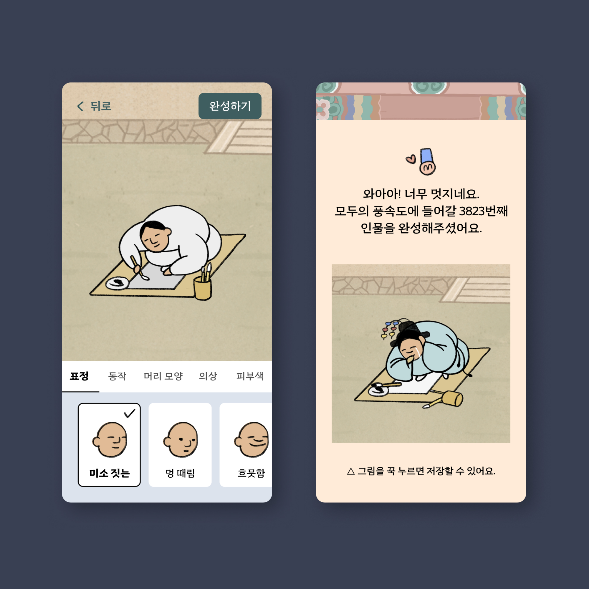

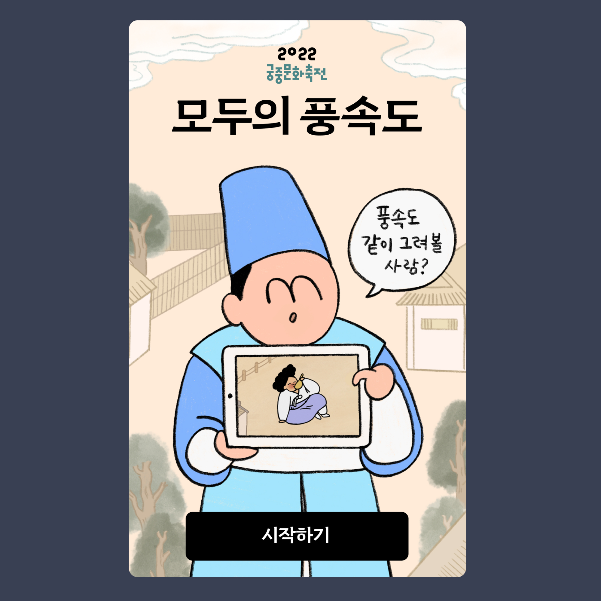
![폰트킷 플랜 구성 변경 안내 안녕하세요, AG 타이포그라피연구소입니다. 폰트킷 플랜의 글꼴 구성이 2026년 11월 1일을 기점으로 변경될 예정입니다. A-Project 글꼴이 플랜에서 제외되며, 변경일 전까지는 동일하게 이용하실 수 있습니다. A-Project는 폰트킷 출시에 맞춰 한시적으로 제공해 온 글꼴이며, 앞으로는 플랜에서 분리되어 별도 상품으로 운영할 예정입니다. 이후 계속 사용을 원하신다면 단품으로 구매해 이용하실 수 있으며, 단품으로 구매하신 라이선스는 그대로 유지됩니다. 변경된 구성을 원하지 않으시는 경우에는 구독 취소를 부탁드리며, 취소하시더라도 결제하신 기간이 끝날 때까지는 폰트킷은 그대로 이용하실 수 있습니다. 문의사항은 agfont@ag.co.kr로 연락부탁드립니다. [플랜 제외 A-Project 글꼴] AG 글결 / AG 하하한글 / AG 한도니 / AG 놀림체 / AG 레트로 퓨쳐 / AG 에이비씨 그로우 한글 / AG 발디 / AG 유니닷 / AG 반찬 / AG 에어로졸 / AG 테크노 조이](https://agfont.com/media/site/4f59c94de4-1788915446/01.jpg)